Corporate identity of Alpha Credit Bank
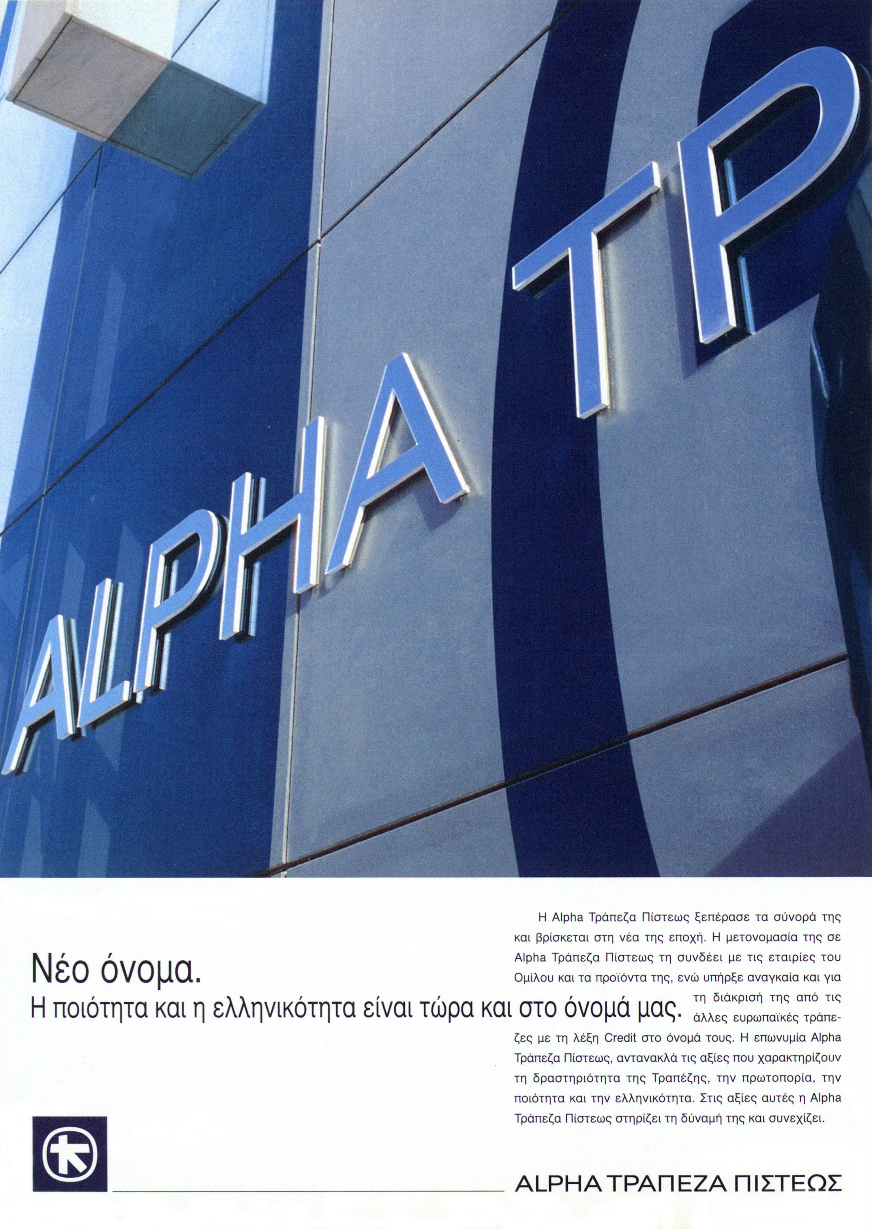
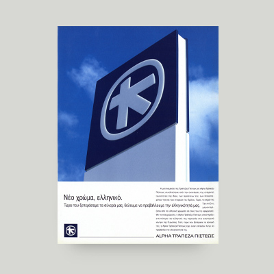
The new corporate identity helped shape a new profile for Alpha Credit Bank. These print media ads belong to the wealth of archival and advertising material produced in the context of designing and implementing Alpha Credit Bank’s new corporate identity from 1994 to 1998.
3 full-page print media ads to present Alpha Credit Bank’s new corporate identity.
The 2 main components stand out:
- The new colour palette emphasising the bank’s Greek identity.
- A fresh bank profile emerging from the new visual elements.
The addition of the “Alpha” component
In the summer of 1994, Credit Bank first announced its new international name, “Alpha Credit Bank”, and, a few months later, the Greek version of the same name for its local operations.
The “Alpha” component was added to the bank’s name as a link to the similarly named undertakings and products of the Group.
With the bank’s operations expanding beyond the domestic market, this component also served as a distinctive mark of the bank’s identity abroad. At that time, there were 43 banks worldwide with “Credit” as part of their names. This was bound to cause confusion among the bank’s partners abroad.
Thanks to the new corporate identity, Alpha Credit Bank now had an entirely new profile that was also consistent with the new, modern era.
The colours of a Greek bank
Blue and white were chosen as a reminder of the bank’s Greek roots, especially in European economic hubs.
To quote the relevant ad: “Now that we have crossed the border, we have a desire to show our Greek roots.”
A gradual change of image
Combined, the changes to the bank’s name, logos and colour palette comprised its new corporate identity. This identity was gradually applied to the branches, products and other undertakings of the Group.
Initially 3 branches were selected to pilot the changes, each of them a typical example of a specific architectural style.
At the same time, branch signs changed too, as the existing green background and orange stripe were abandoned.
The letters in the bank’s name were now silver-coloured, they protruded from the background and were individually backlit at night.
The appearance of ATMs also changed, as they were now bordered by a blue frame.
The new corporate identity was immediately applied to the entirety of the bank’s communication materials: stationery paper, envelopes, business cards, cheques, statements, passbooks, credit cards and cash cards.
The modern look was also a bold statement that helped the new profile stand out both at branch level and across the bank’s material.
Expanding abroad
Gradually, the new corporate identity started to make its way into the Group’s undertakings abroad.
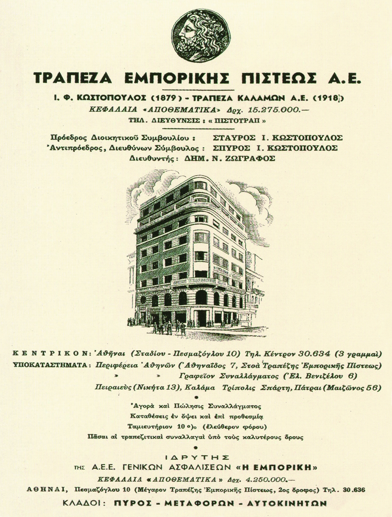
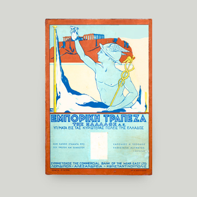
The London branch was the first to undergo aesthetic changes. Alpha Bank London, created after the acquisition of the Commercial Bank of London, followed suit.
Alpha Credit Bank’s collection of advertising material
The items reflecting the new corporate identity belong to the wealth of archival and advertising material produced in the context of designing and launching Alpha Credit Bank’s new corporate identity.
The material covers the years from 1994 to 1998.
Together for the win
Alpha Credit Bank dedicated a special issue of its internal publication Mazi (Greek for “together”) to the new corporate identity. The issue aimed at informing the bank’s employees, management and associates about a new era in the Alpha Group, and catching them up with the practical details of applying the corporate identity.
The Alpha Bank Historical Archives are not open to the public.
Research visits can be organised upon request.
Contact us to request a visit.
